SwiftTUI underneath. Chio on top.

Beautiful terminal
interfaces for Swift.

Reusable views, native SwiftTUI controls, and one inherited Chio style. Compose them into your own Swift terminal application.

Compare three styles of the same interface ↗

chio / Singlish / attractive, pretty, good-looking.

Explore Chio

Recorded in a real terminal

Reusable Chio views. Supply your state and content; choose presentation options independently of the theme.

Chio styles native SwiftTUI controls. The runtime keeps editing, focus, scrolling and presentation.

Runnable applications composed from Chio views and native SwiftTUI controls, using local demo data.

MapView

Reusable view

Retained vector geography, camera bindings, markers and routes in a native terminal view.

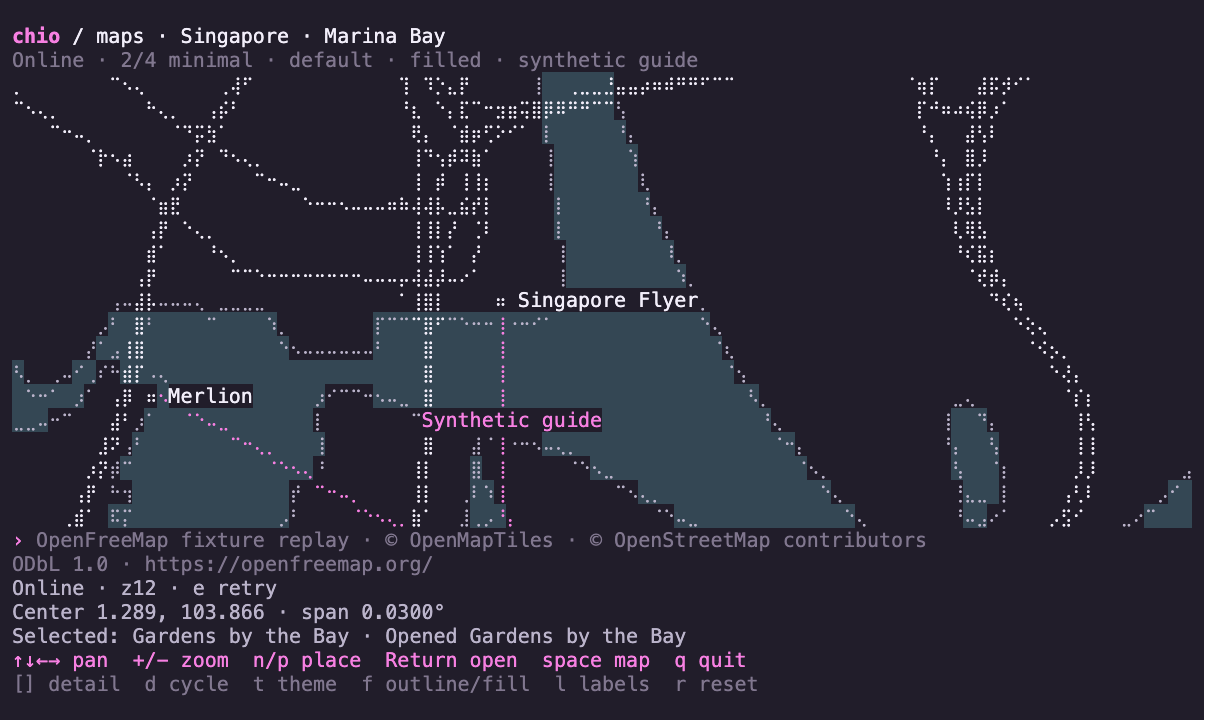
OpenFreeMap street vectors around Singapore, replayed from local XYZ tile fixtures, with location markers, an authored route and minimal visual detail.

The recording replays fixed OpenFreeMap world and street XYZ tiles over local HTTP through the real MapTileLoader. It demonstrates coverage, loading, retry, annotations and detail changes; static previews show minimal detail. Replay inputs and data credits.

The command below opts into current OpenFreeMap acquisition. Omit --online for bundled offline geography. A writable raw-tile cache reuses fresh responses; immutable tile packs retain offline data without expiry or network fallback.

Download recording ↓

Try this example

Map API and usage
swift run -c release chio-maps --online --map street

For an offline world pack, run swift run -c release chio-maps --write-tile-pack .build/world.chiomap once, then swift run -c release chio-maps --tile-pack .build/world.chiomap. This uses bundled coarse world tiles and the programmatic pack API; it does not download street data.

Arrow keys pan · + / − zoom · e retries online acquisition · n / p select and center a location · Return activates · Tab moves native focus · [ / ] lower/raise detail · d cycles levels · Space switches world/street · t changes theme · f switches outlines/fills · l toggles labels · r resets · q quits. Minimal is the default; use --detail silhouette, abstract or source to start elsewhere.

Use in your view

API guide ↗

source: MapSource and overlays: MapOverlays are retained inputs; camera: MapCamera and selection: String? are application-owned bindings.

MapView(source: source, camera: $camera, selection: $selection,
        overlays: overlays, detail: .minimal)
    .mapFills(true)
    .frame(width: 100, height: 26)
    .style(.default)

Presentation options. Detail: minimal, silhouette, abstract or source. Fills or outlines and labels are separate options; source zoom chooses input resolution, while theme chooses paint.

Map acquisition and storage. MapTileLoader · MapTileCache · MapTilePack — explicit, application-owned opt-ins beside the view.

Chio
MapView, MapTileLoader, opt-in MapTileCache, MapTilePack, OpenMapTilesSource, checked camera and geography, location markers, route overlays and shared themes.
SwiftTUI
Native drawing, text labels, layout and keyboard input.
Application
Network opt-in, retained source and coverage status, camera and selection bindings, location annotations, authored routes and activation feedback.
Map data
Offline world: Natural Earth public-domain land · © OpenStreetMap contributors · ODbL 1.0 · OpenFreeMap · © OpenMapTiles
View example source

MarkdownView

Reusable view

Render a retained Markdown document with Swift highlighting and optional native link actions.

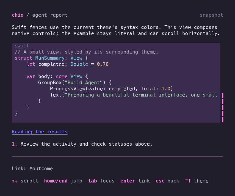
A Swift code block in an agent report, with themed keywords, types, strings, numbers, and comments above local link feedback.

Swift code keeps its spacing and native horizontal scrolling, with token colors from the theme. Inline links retain native focus and wrapping; the application reports destinations locally. Follow both through light and dark themes and a compact terminal.

Download recording ↓

Try this example

Keyboard controls
swift run -c release chio-dashboard

Press Enter to open the selected agent’s Markdown report.

Use in your view

API guide ↗

document: MarkdownDocument is created by the content owner when the source changes.

ScrollView {
    MarkdownView(document)
        .codeHighlighting(.automatic)
}
.style(.default)

Presentation options. Code highlighting: automatic or plain. Links are passive unless you supply an OpenLinkAction; the application decides how to open them.

Chio
MarkdownDocument, MarkdownView, ChioLinkStyle
SwiftTUI
ScrollView, OpenLinkAction and native inline links.
Example code
Report content and local link feedback. Open a report from the dashboard to try it.
View example source

SearchableList · SearchableChecklist

Reusable view

Search stable choices without confusing keyboard focus, selected rows and checked membership.

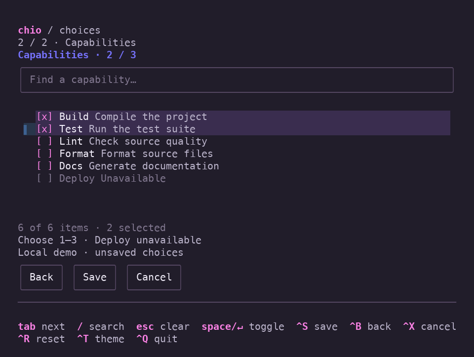
A searchable capabilities checklist with Build and Test checked and Deploy unavailable.

Keyboard focus and checked choices have distinct jobs. Filtering keeps the choices you already made.

Download recording ↓

Try this example

Keyboard controls
swift run -c release chio-dashboard --choices

Use in your view

API guide ↗

agents and capabilities are application-owned Identifiable models with name fields; selection is an optional agent ID and selectedIDs is a set of capability IDs.

VStack {
    SearchableList(agents, selection: $selection, searchText: \.name) {
        Text($0.name)
    }
    SearchableChecklist(capabilities, selection: $selectedIDs,
                        searchText: \.name) {
        Text($0.name)
    }
}
.style(.default)

Presentation options. Single choice or checked set; fuzzy filtering and enabled-row predicates are supported options. Applications own limits and validation. Filtering preserves checked IDs.

Chio
SearchableList, SearchableChecklist, FormField
SwiftTUI
List, Button and native focus.
Example code
Choice limits, validation rules, and the two-step workflow.
View example source

HistoryChart · MeasurementGauge

Reusable views

Time-proportional history and measurements with independent target bands and reference markers. Applications supply every observation and its meaning.

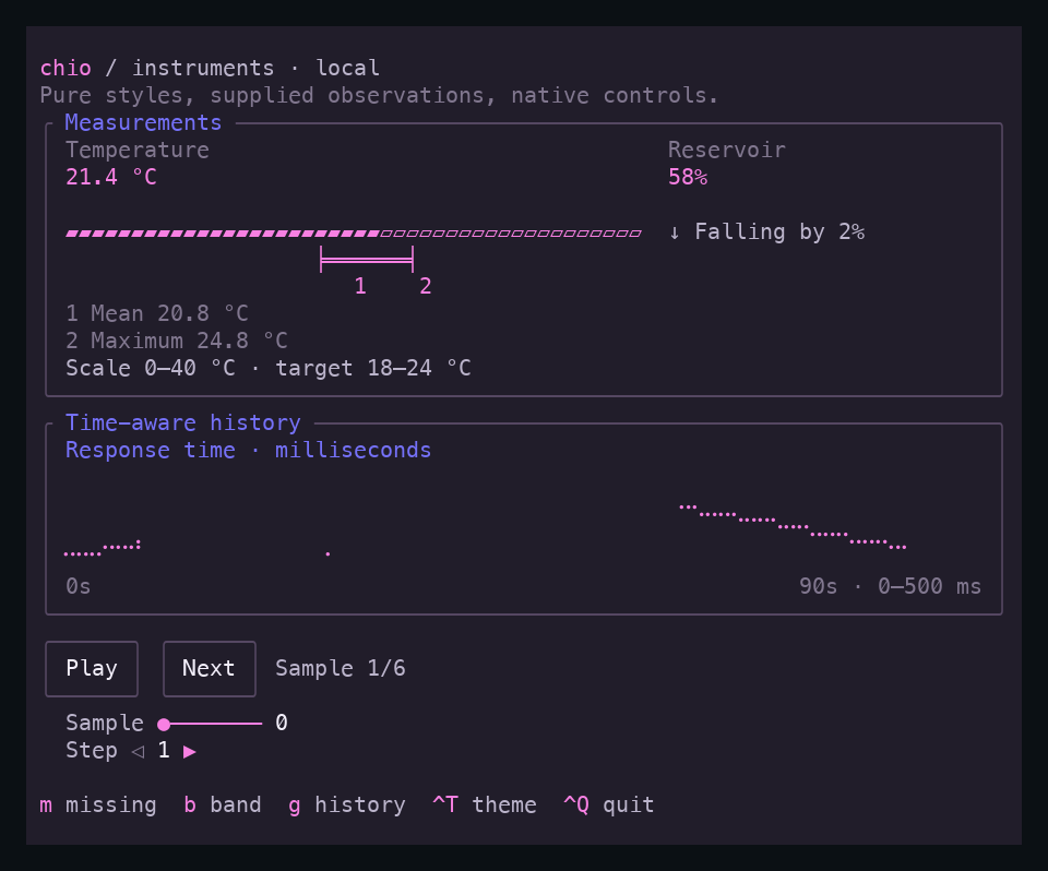
Synthetic temperature reading with a target band and independent mean and maximum markers, time-proportional response history, and themed native playback controls.

Keep source references when the current reading is missing, compare the reading with its target band, and show explicit history breaks. Equal timestamps remain equal. Playback, compact layout and the synthetic data belong to the example.

Download recording ↓

Try this example

Keyboard controls
swift run -c release chio-dashboard --instruments

m missing · b band · g history · Ctrl-T theme · Ctrl-Q quit

Use in your view

API guide ↗

Construct checked history, window and reference values once when their source inputs change.

VStack {
    LabeledContent("Temperature", value: "21.4 °C")
        .labeledContentStyle(.instrument)
    MeasurementGauge(position: 0.535,
                     referenceMarks: references,
                     targetBand: target)
    HistoryChart(history, window: window)
        .frame(height: 4)
}
.style(.default)

Presentation options. Annotated bars with zero to two references and an optional target band; automatic or fixed history scale. Captions and marker tracks need their complete allocation.

Chio views
HistoryChart · MeasurementGauge · KeyHints
Native controls with Chio styles
LabeledContent · Slider · Stepper · Button · GroupBox
Application owns
Observations · source summaries · layout choices · playback task
View example source

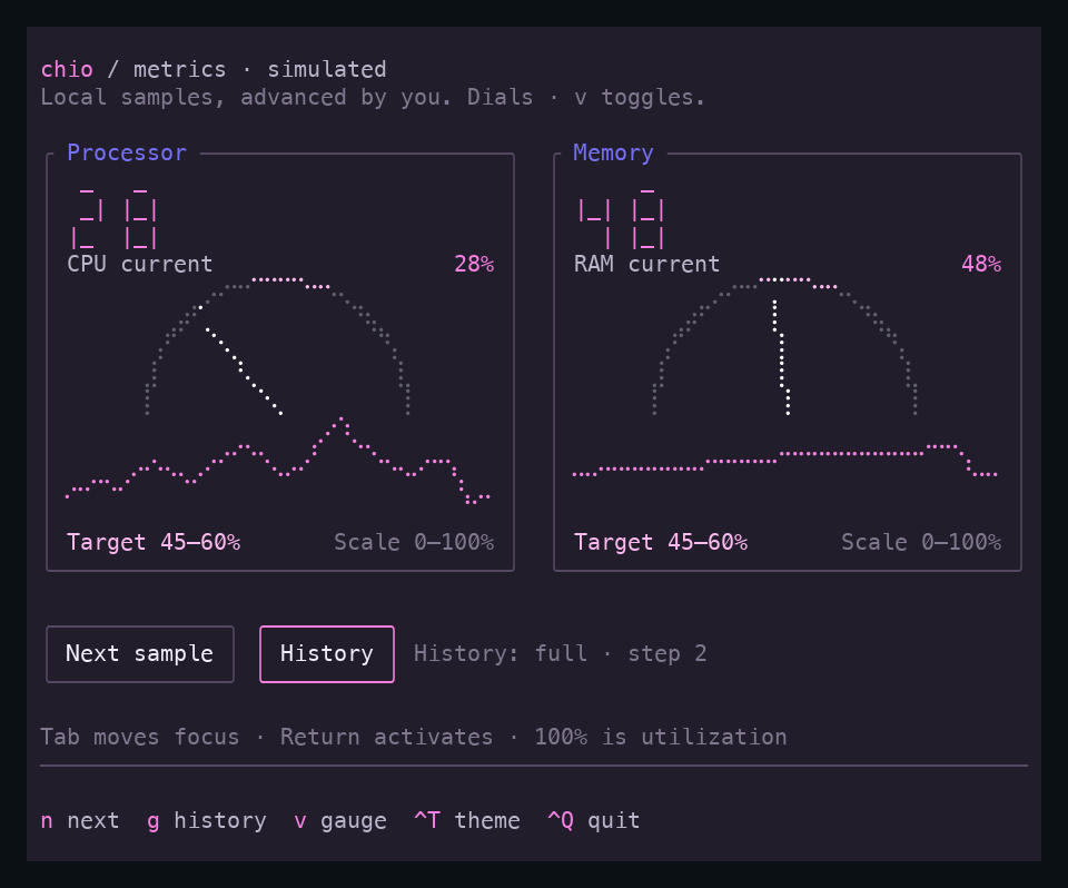
MeasurementGauge · Sparkline · InstrumentReadout

Reusable view

Present normalized measurements, missing samples and formatted readings without owning collection or clocks.

Dark instrumentation panels with border titles, segmented numeric readouts, measurement gauges, single-series history graphs, and native Next sample and History buttons.

Advance local samples, switch between bars and segmented target dials, show missing or empty history, and compare segmented readouts and compact border titles across three palettes. Chio presents the readings; the application owns the data and updates.

Download recording ↓

Try this example

Keyboard controls
swift run -c release chio-dashboard --metrics

n next sample · g history · v bar/dial · Ctrl-T theme · Ctrl-Q quit

Use in your view

API guide ↗

samples: [Double?] is application-owned history; labels supply the current reading, target interval and measurement scale.

let target = try MeasurementGauge.TargetBand(
    lowerBound: 0.45, upperBound: 0.60)

VStack {
    InstrumentReadout("64")
    Text("Current 64%")
    MeasurementGauge(position: 0.64, targetBand: target, style: .dial)
    Text("Target 45–60% · Scale 0–100%")
    Sparkline(samples, scale: .fixed(0...1))
        .frame(width: 24, height: 4)
}
.style(.default)

Presentation options. Gauge: normalized bar, plain dial, or segmented dial with an authored target interval. Reference marks remain available on bars. Readout: segmented or plain. History: automatic or fixed scale; nil readings leave gaps. These choices are independent of theme.

Chio
MeasurementGauge, InstrumentReadout, Sparkline, ChioStyle.btop, ChioGroupBoxStyle
SwiftTUI
Canvas, GroupBox, Button
Example code
Fixed sample data, normalization, manual updates, bar/target-dial choice, authored numeric captions and adaptive instrument layout.
View example source

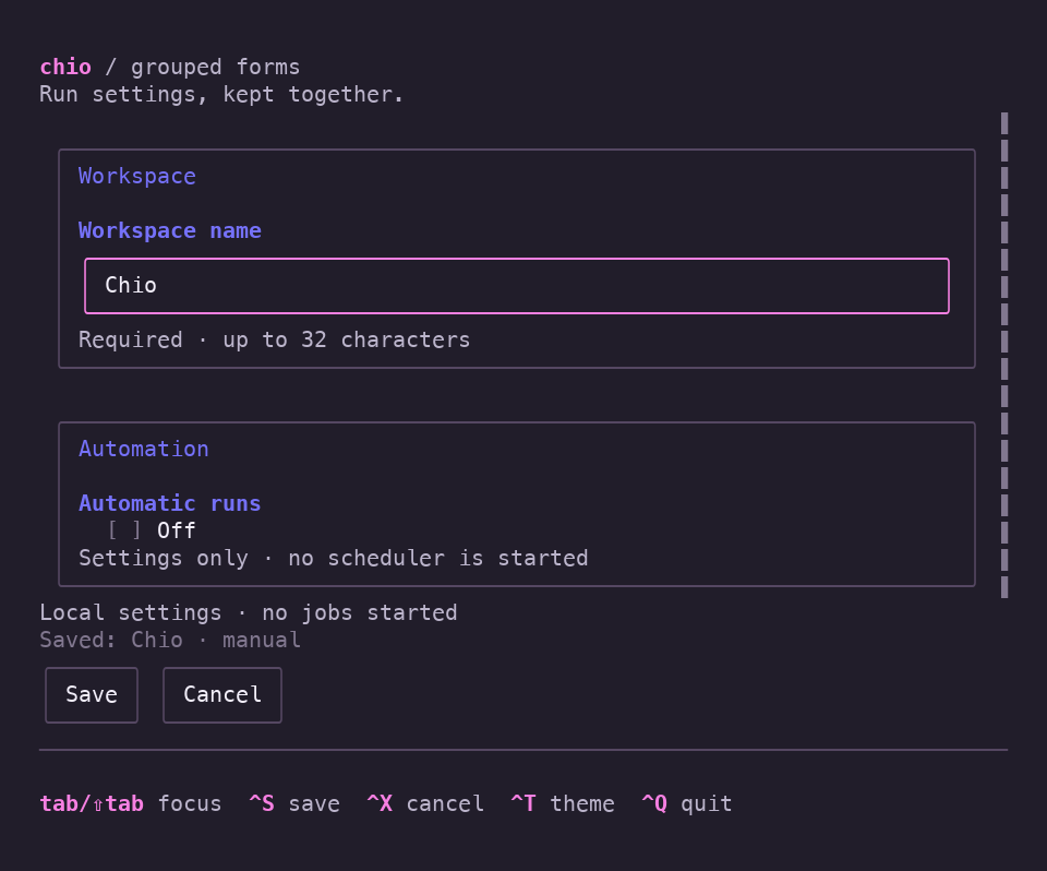
FormField

Reusable view

Wrap native editors with consistent labels, help and current validation errors.

A dark grouped settings form with Workspace and Automation sections, a saved-values summary, and Save and Cancel buttons.

Reveal related timing fields, correct an inline error, and save a local snapshot. Cancel restores the latest saved values; native focus and scrolling keep editing available through theme and size changes. No jobs are started.

Download recording ↓

Try this example

Keyboard controls
swift run -c release chio-dashboard --forms

Use in your view

API guide ↗

name: String is an application-owned binding; nameError: String? is supplied by the application validation rules.

FormField("Name", description: "Choose a display name.", error: nameError) {
    TextField("Name", text: $name)
}
.style(.default)

Presentation options. Compose TextField, SecureField, TextEditor, Picker or Toggle. FormValidation tracks error visibility; applications own draft values, validation and submit/cancel policy.

Chio
FormField, FormValidation
SwiftTUI
TextField, Toggle and native focus.
Example code
Draft values, validation rules, conditional fields, and save/cancel behavior.
View example source

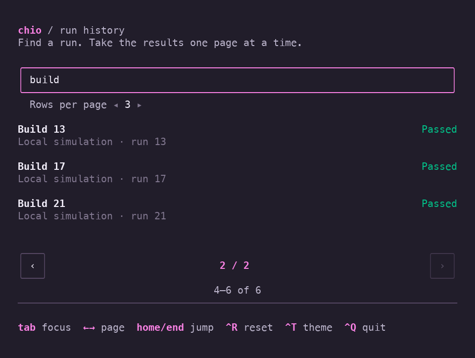
PageControl

Reusable view

Navigate a finite item range with native buttons and an immutable Pagination value.

A filtered run history with three Build results, native page buttons, and a 4–6 of 6 item summary.

Filter local run history, change rows per page, and navigate finite results with native controls. Empty results and theme changes stay part of the same workflow.

Download recording ↓

Try this example

Keyboard controls
swift run -c release chio-dashboard --pagination

Use in your view

API guide ↗

pagination: Pagination is application-owned state, initialized with a nonnegative totalCount and positive pageSize.

PageControl(pagination: $pagination)
    .style(.default)

Presentation options. Pagination supplies the item range. Replacing total count can retain/clamp the page; resizing preserves the first item. Reset policy and data loading belong to the application.

Chio
Pagination, PageControl
SwiftTUI
Picker, ScrollView and native buttons.
Example code
Local run history, filtering, and page-size choices.
View example source

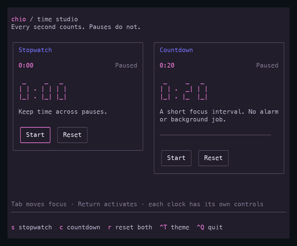
DurationText

Reusable view

Format elapsed and remaining durations with the same rounding in plain and segmented lettering.

A dark time studio with plain and segmented duration labels, independent stopwatch and countdown panels, native pause and reset buttons, and a progress track.

Chio formats elapsed and remaining time in plain and segmented styles; this example supplies its own clock state and controls. Pause, resume and reset both clocks, then follow countdown expiry through a theme change and a compact terminal.

Download recording ↓

Try this example

Keyboard controls
swift run -c release chio-dashboard --timers

Use in your view

API guide ↗

The application supplies measured durations and owns pause, resume, limits and expiry.

VStack {
    DurationText(elapsed: .seconds(83))
    DurationText(remaining: .milliseconds(12_250), style: .segmented)
}
.style(.default)

Presentation options. Style: plain or segmented. Elapsed fractions round down; positive remaining fractions round up. A native TimelineView can drive updates.

Chio
DurationText with plain and segmented readout styles for elapsed and remaining time.
SwiftTUI
TimelineView, ProgressView, Button
Example code
Clock state, pause/resume, reset, and countdown expiry.
View example source

KeyboardHelp · KeyHints · KeyHint · StatusBar

Reusable view

Share shortcut descriptions between compact hints and an expanded native help presentation.

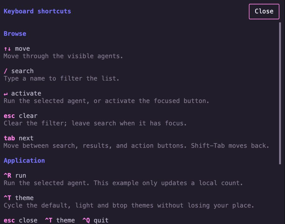
Grouped keyboard shortcuts with a native scrolling reference and compact footer hints.

Press ? while browsing or F1 during editing to open grouped help. Closing returns to the retained control and query; typing ? in search remains text. All run actions update a local counter.

Download recording ↓

Try this example

Keyboard controls ↗
swift run -c release chio-dashboard --keyboard-help

Use in your view

API guide ↗

navigation: [ShortcutHint] contains your descriptions. Native handlers register the actions; these views only present them.

VStack {
    KeyboardHelp([ShortcutGroup("Navigation", shortcuts: navigation)])
    StatusBar { KeyHints(navigation) }
    KeyHints { KeyHint("F1", "Help") }
}
.style(.default)

Presentation options. Compact KeyHints or grouped KeyboardHelp share ShortcutHint values. StatusBar supplies footer presentation. The application chooses context and owns showing, scrolling and closing help.

Chio
KeyboardHelp, KeyHints, KeyHint, StatusBar, ShortcutHint, ShortcutGroup
SwiftTUI
Native state, focus, scrolling and input.
Application
Context, key handlers and modal presentation.
View example source ↗

FilePicker

Reusable view

Choose a readable regular file with native search, folder navigation and explicit confirmation.

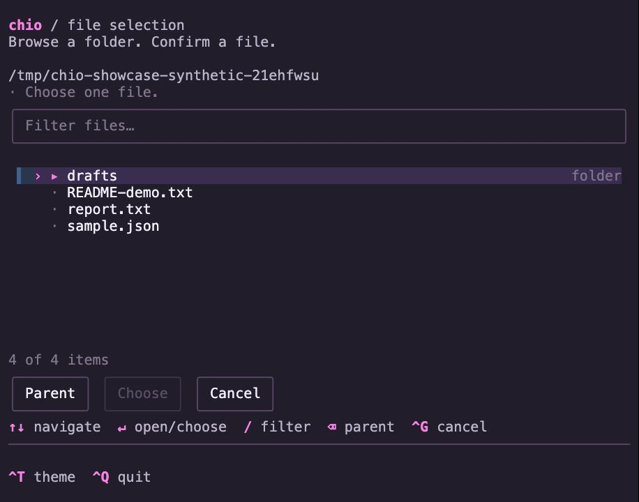
A file picker browsing an authored local fixture directory with a searchable list and confirmation controls.

This capture uses local fixture paths. The runnable example reads directory metadata and displays a chosen path; it does not open file contents or modify files.

Download recording ↓

Try this example

Keyboard controls ↗
swift run -c release chio-dashboard --files

Use in your view

API guide ↗

startingDirectory: URL and selectedFile: URL? are application-owned inputs. Default callbacks allow the binding to receive the confirmed path.

FilePicker(directory: startingDirectory, selection: $selectedFile,
           allowedExtensions: .only(["swift", "md"]))
    .style(.default)

Presentation options. Extension filter: all or only specified values. Hidden files are optional. Cancel preserves the prior selection; the starting directory does not restrict navigation. Applications handle opening errors.

Chio
FilePicker, FileExtensionFilter
SwiftTUI
Native state, focus, scrolling and input.
Application
Starting directory, file filter and confirmation/cancellation workflow.
View example source ↗

ChioButtonStyle · ChioPromptStyle · ChioSpinnerStyle

Native SwiftTUI style

Apply coherent action, focus and feedback paint to native SwiftTUI controls.

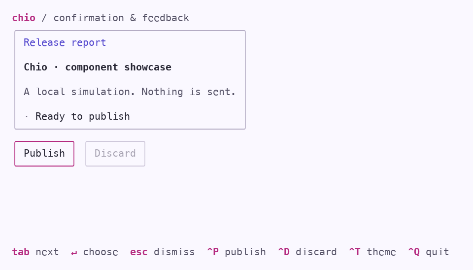
The light theme's feedback screen with an accent outline around the focused Publish button.

Shared theme roles carry through buttons, focus, confirmation, and feedback. Your application supplies the meaning.

Download recording ↓

Try this example

Keyboard controls
swift run -c release chio-dashboard --feedback --light

Use in your view

API guide ↗

publish() is an application-owned action. This recorded example simulates publishing locally; nothing is sent.

Button("Publish") { publish() }
    .style(.default)

Presentation options. The theme installs default native styles. Toasts use explicit ChioToastStyle; applications choose tone and own completion, confirmation and dismissal.

.style(...) installs styles for groups, lists, tables, tabs, palettes, fields, editors, progress, spinners, prompts, buttons, links, pickers, toggles, scrolling and disclosure. See all installed styles · Tabs · Fields & editors · Prompts & toasts.

Chio
ChioButtonStyle, ChioPromptStyle, ChioSpinnerStyle, ChioToastStyle
SwiftTUI
Button, Spinner, dialogs, and toast presentation.
Example code
Simulated publishing and completion feedback; nothing is sent.
View example source

ChioScrollViewStyle

Native SwiftTUI style

Theme native scroll indicators while SwiftTUI owns input and retained position.

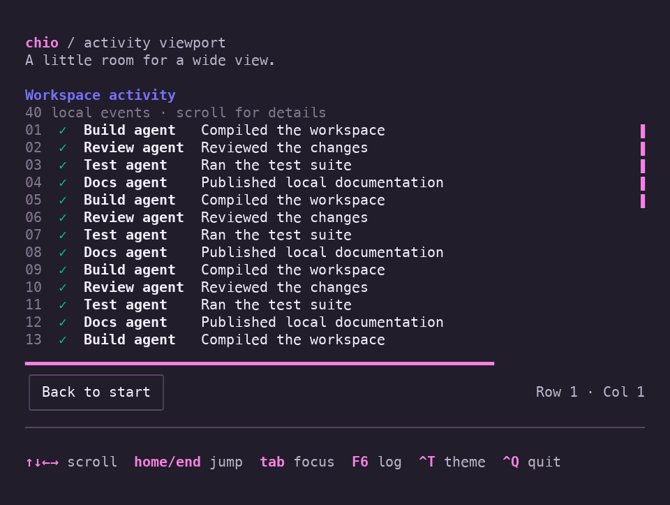
A dark activity log of forty local events with native scroll indicators, row and column status, and a Back to start button.

Explore a wide local event log with native scrolling on both axes. Semantic indicators share the theme, and the position stays with you through a lighter palette and a compact terminal.

Download recording ↓

Try this example

Keyboard controls
swift run -c release chio-dashboard --viewport

Use in your view

API guide ↗

position: ScrollCellOffset is application-owned state; ActivityLog is your authored content view.

ScrollView([.horizontal, .vertical], position: $position) {
    ActivityLog()
}
.frame(height: 16)
.style(.default)

Presentation options. Choose horizontal, vertical or both axes and bound their allocation. Native scrollIndicators controls track visibility; a nearer scrollViewStyle overrides the installed style.

.style(...) installs styles for groups, lists, tables, tabs, palettes, fields, editors, progress, spinners, prompts, buttons, links, pickers, toggles, scrolling and disclosure. See all installed styles · Tabs · Fields & editors · Prompts & toasts.

Chio
ChioScrollViewStyle
SwiftTUI
ScrollView, ScrollCellOffset for scrolling and position.
Example code
Event log content and the back-to-start action.
View example source

ChioDisclosureGroupStyle

Native SwiftTUI style

Give native disclosure groups a compact header, focus treatment and indentation.

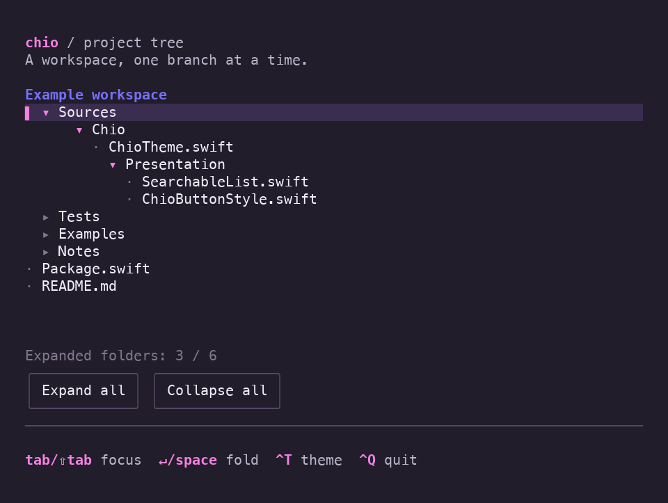
A dark example workspace with Sources, Chio, and Presentation expanded into file labels, three collapsed folders, and bulk expansion buttons.

Native disclosure groups reveal a local example hierarchy. Fold a parent and reopen it to find the nested expansion choices remembered by the application, then change theme and terminal size.

Download recording ↓

Try this example

Keyboard controls
swift run -c release chio-dashboard --tree

Use in your view

API guide ↗

expanded: Bool is an application-owned binding; retain child values outside the group if they must survive collapse.

DisclosureGroup("Details", isExpanded: $expanded) {
    Text("Build settings and notes go here.")
}
.style(.default)

Presentation options. Nest groups for authored hierarchies. SwiftTUI owns expansion and geometric focus; the example folder labels are local fixtures and do not read the filesystem.

.style(...) installs styles for groups, lists, tables, tabs, palettes, fields, editors, progress, spinners, prompts, buttons, links, pickers, toggles, scrolling and disclosure. See all installed styles · Tabs · Fields & editors · Prompts & toasts.

Chio
ChioDisclosureGroupStyle
SwiftTUI
DisclosureGroup, ScrollView
Example code
The folder hierarchy and remembered expansion choices.
View example source

Agent dashboard

Example app

Compose searchable agents, reports, native controls and contextual hints into a local workspace.

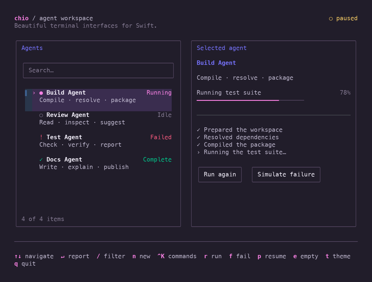
A dark terminal dashboard with four agents, a selected Build Agent, progress, and keyboard hints.

Searchable selection, semantic status colors, and an application that feels like one coherent interface.

Download recording ↓

Try this example

Keyboard controls
swift run -c release chio-dashboard
Chio
SearchableList, StatusBar, KeyHints and themed control styles.
SwiftTUI
GroupBox, ProgressView, layout, and focus.
Example code
Agent simulation, run actions, reports, and responsive screen composition.
View example source

Review inbox

Example app

Compose a searchable local queue with a Markdown preview and responsive reader flow.

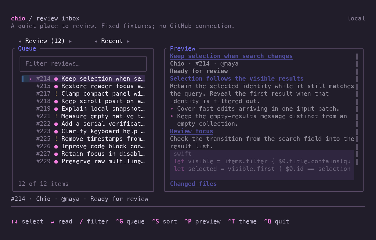
A dense review queue beside a Markdown preview, with search, queue and sort controls, selected review metadata, and keyboard hints.

Sort and filter a local review queue while selection stays attached to its identity. The queue and preview grow together as the terminal widens; Enter opens the full reader at any width. Native controls and existing Chio components carry the whole example.

Download recording ↓

Try this example

Keyboard controls
swift run -c release chio-dashboard --inbox
Chio
SearchableList, MarkdownView, StatusBar, ChioGroupBoxStyle
SwiftTUI
Picker, ScrollView, layout, and full-screen presentation.
Example code
Review fixtures, queue membership, sorting, selection, and reader flow.
View example source

Diff reader prototype

Example app · prototype

Explore an application-owned, read-only split or unified diff with native scrolling and hunk navigation.

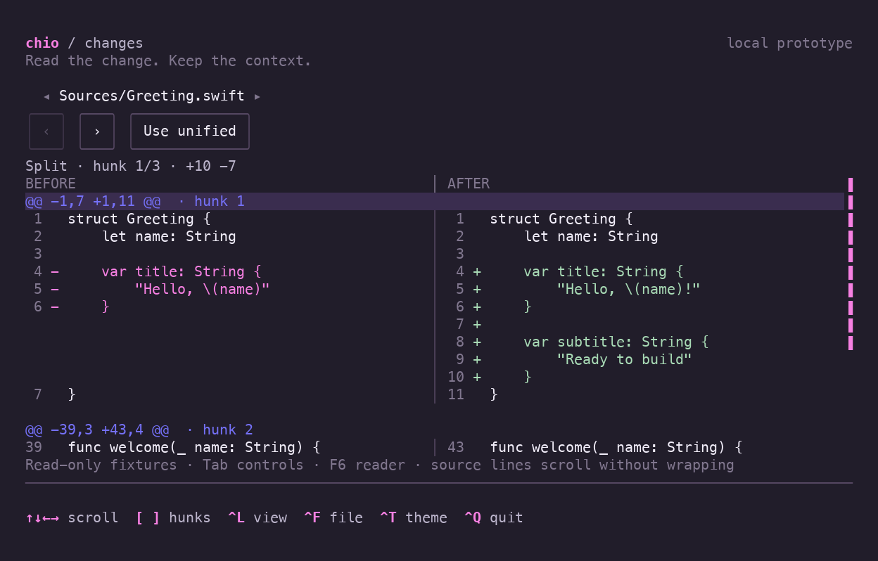
A read-only split diff with paired line-number gutters, added and removed source lines, layout controls, and hunk navigation.

A read-only prototype pairs line-number gutters with changed source lines. Jump between hunks, switch between split and unified layouts, and follow the narrow unified mode through theme and terminal-size changes.

Download recording ↓

Try this example

Keyboard controls
swift run -c release chio-dashboard --diff

The diff renderer belongs to this example; Chio does not export a DiffView.

Chio
Existing theme and control styles, KeyHints, StatusBar
SwiftTUI
Text, ScrollView, ScrollViewReader, Picker, Button
Example code
The normalized local diff fixture, unified/split layout, and hunk navigation.
View example source

Press play to watch. Pause, seek, or open fullscreen for a closer look. The shared theme follows you through the catalog and updates each preview, snippet and run command. Recordings keep their original captured themes; try the binary to use the controls yourself.